카테고리 없음
[Seaborn]
봉그리봉봉
2024. 7. 9. 10:33
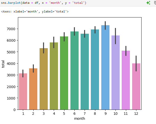
날씨가 추운 11~2월 겨울에는 사용량이 적다 = 사람들이 자전거를 많이 안 타나보다.
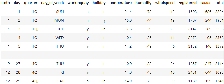
workingday 와 holiday 의 데이터 타입을 str로 변경 후 0을 n으로, 1을 y로 데이터 변경
df = pd.read_csv("bike.csv")
df[['workingday','holiday']] = df[['workingday','holiday']].astype(str)
df[['workingday', 'holiday']] = df[['workingday', 'holiday']].replace({'0': 'n', '1': 'y'})
df
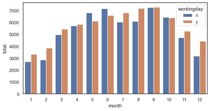
막대 그래프 그리기 (x : 월 , y = 전체 사용량, 카테고리 일하는 날 y or n )
sns.set_theme(rc={'figure.figsize': (8,4)}, style = 'white') #그래프의 테마를 소개
sns.barplot(data = df, x = 'month', y = 'total',errorbar = None, hue = 'workingday')
plt.show()
막대 그래프 그리기 (x : 월 , y = 정기권 이용자, 카테고리 일하는 날 y or n_)
sns.set_theme(rc={'figure.figsize': (8,4)}, style = 'white') #그래프의 테마를 소개
sns.barplot(data = df, x = 'month', y = 'registered',errorbar = None, hue = 'workingday')
plt.show() #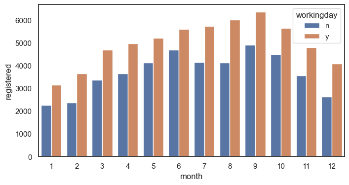
막대 그래프 그리기 (x : 월 , y = 정기권x, 캐주얼 이용자, 카테고리 일하는 날 y or n_)
sns.set_theme(rc={'figure.figsize': (8,4)}, style = 'white') #그래프의 테마를 소개
sns.barplot(data = df, x = 'month', y = 'casual',errorbar = None, hue = 'workingday')
plt.show() #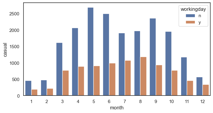
라인그래프 그리기 (x : 월 , y =정기권x, 캐주얼, 카테고리 일하는 날 y or n_)
sns.set_theme(rc={'figure.figsize': (8,4)}, style = 'white') #그래프의 테마를 소개
sns.lineplot(data = df, x = 'month', y = 'casual',errorbar = None, hue = 'workingday')
plt.show() #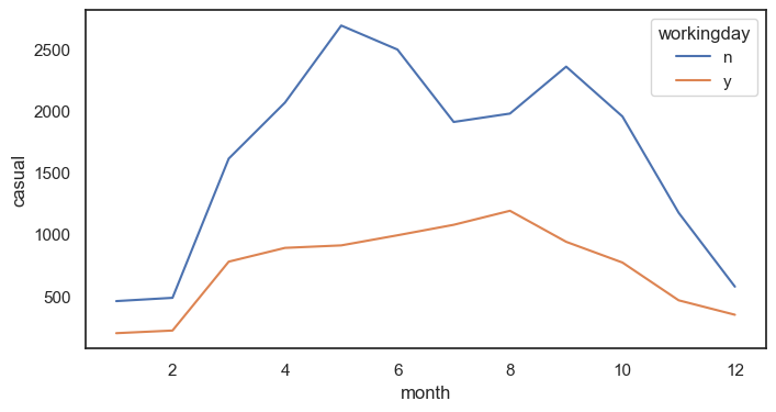
stripplot그래프 그리기 (x : 월 , y = 총 사용량, 카테고리 일하는 날 y or n_)
sns.set_theme(rc={'figure.figsize': (8,4)}, style = 'white')
sns.stripplot(data = df, x = 'month', y = 'total', hue = 'workingday') #월별로 데이터가 어떻게 분포되어 있는지 살펴볼 수 있음
#hue = workingplot을 추가하니 y와 n이 다르게 출력됨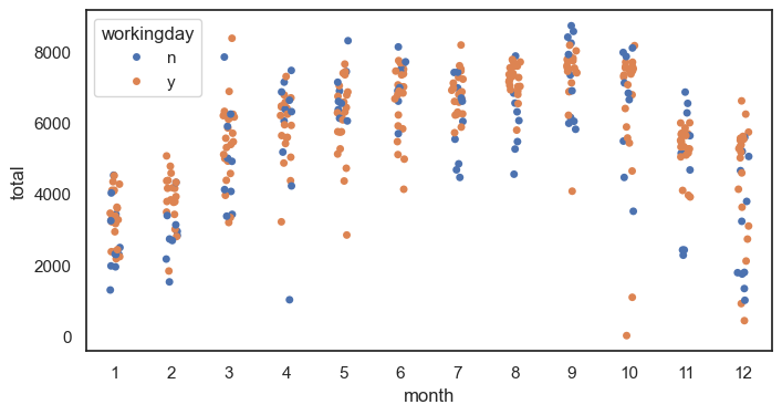
swarmplot그래프 그리기 (x : 월 , y = 총 사용량, 카테고리 일하는 날 y or n_)
sns.swarmplot(data = df, x = 'month', y = 'total', hue = 'workingday')
#swarm plot에서는 동일한 값에서 옆으로 쭉 쌓임 값들이 많이 몰린 위치
#큰 데이터에서는 불리, 비교적 작은 데이터셋잉 유리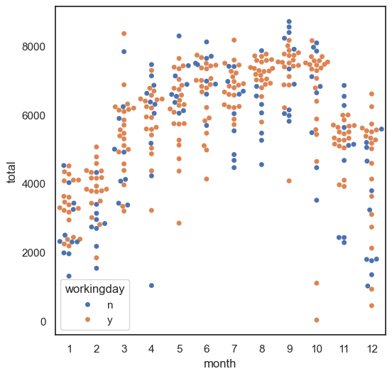
boxplot그래프 그리기 (x : 일 , y = 정기권 사용량 order = mon to sun)
sns.boxplot(data = df, x = "day_of_week", y = "registered", order = ['MON','TUE','WED','THU','FRI','SAT','SUN'])
plt.show()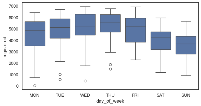
violinplot그래프 그리기 (x : 일 , y = 정기권 사용량 order = mon to sun)
sns.violinplot(data = df, x = "day_of_week", y = "registered", order = ['MON','TUE','WED','THU','FRI','SAT','SUN'])
plt.show()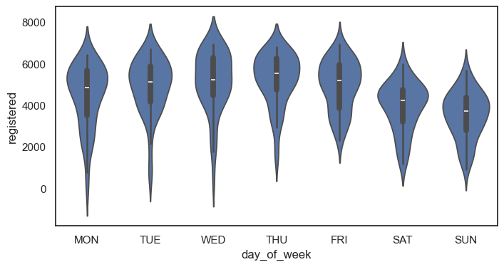
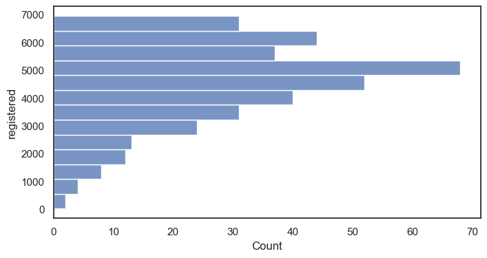
histplot그래프 그리기 (x : 정기권 사용)
sns.histplot(data = df, x = "registered") #y값 따로 없이 count 한가지 값에 대해 분포를 살피는 것
plt.show()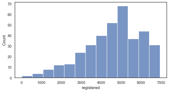
histplot그래프 그리기 (y: 정기권 사용)
histplot그래프 그리기 (y: 정기권 사용, bins = 10 막대 10개 )
seaborn의 경우 알아서 막대의 갯수를 세워줌
sns.histplot(data = df, x = "registered", bins = 10) #y값 따로 없이 count 한가지 값에 대해 분포를 살피는 것
plt.show()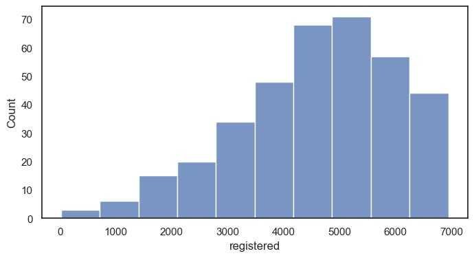
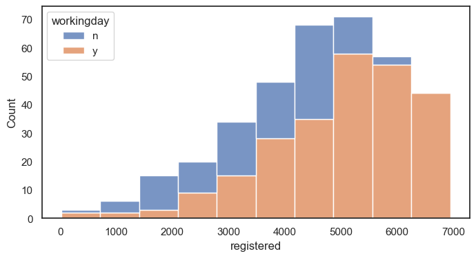
histplot그래프 그리기 (y: 정기권 사용, bins = 10 막대 10개, 카테고리 일하는 날에 따라 )
겹쳐서 그리기
kdeplot그래프 그리기 (x: 정기권 사용)
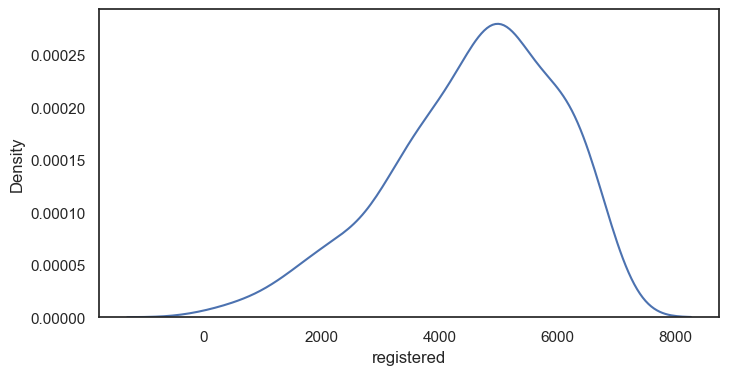
kdeplot그래프 그리기 (x: 정기권 사용) ++ bw_method = 2
bw_method : KDE의 대역폭(bandwidth)
커널의 부드러움이 조절됩니다. 숫자가 클수록 더 부드럽고 넓은 분포를 가지며, 숫자가 작을수록 더 날카롭고 좁은 분포를 갖습니다.
sns.kdeplot(data = df, x = 'registered', bw_method = 2)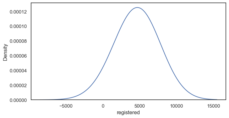
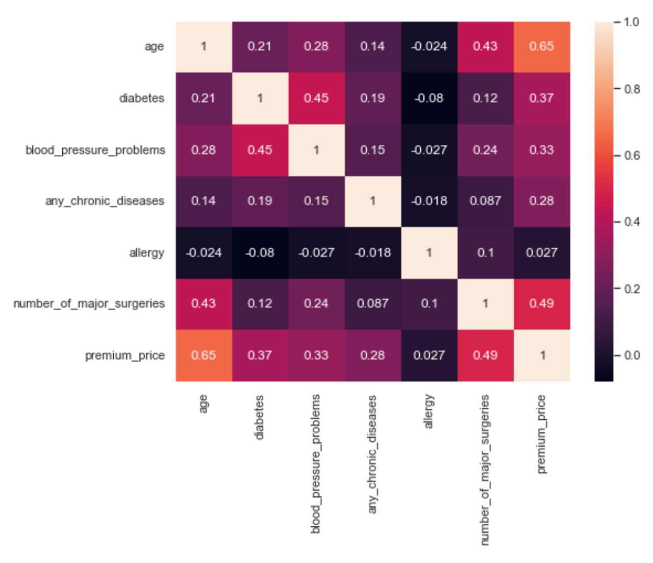
상관관계 (corr)
-1부터 1사이의 값으로
상관관계 = 0 -> 상관관계가 없다.
상관관계 > 0 -> a가 커질 때 b도 커진다 :양의 상관관계
상관관계가 <0 -> a가 커질 때 b는 작아진다. : 음의 상관관계
두 특성의 상관관계를 분석한 것을 회귀 분석
이를 하나의 선으로 나타낸 것을 회귀선 regplot에 사용됨 !
scatterplot그래프 그리기 (x: temperature사용, y = 총 사용량 )을 통한 상관관계 파악
스캐터에 유리한 테마 세팅
sns.set_theme(rc = {'figure.figsize':(6,6)},style = 'white')
sns.scatterplot(data = df, x = 'temperature', y = 'total')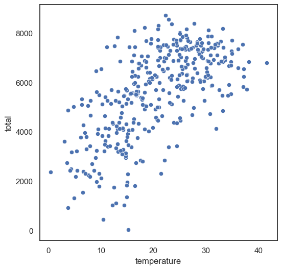
regplot 그래프 그리기 (x: temperature사용, y = 총 사용량 )을 통한 회귀선 표시
sns.regplot(data = df, x = 'temperature', y = 'total')
#regression line : 회귀선 : 두 값의 상관관계를 분석한 선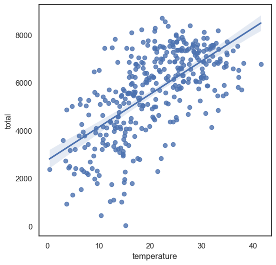
regplot 그래프 그리기 (x: windspeed사용, y = 총 사용량 )을 통한 회귀선 표시
sns.regplot(data = df, x = 'windspeed', y = 'total')
#regression line : 회귀선 : 두 값의 상관관계를 분석한 선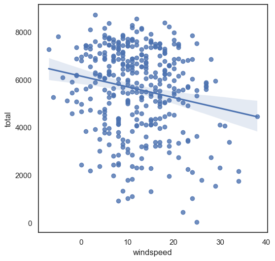
corr()을 통해 직접 수치로 확인하기
df.corr(numeric_only = True)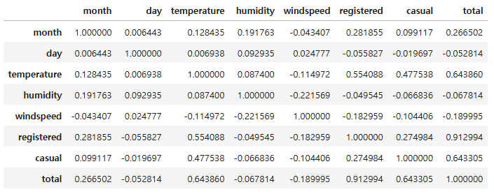
corr()을 통해 원하는 컬럼의 상관관계만 확인하기
df.corr(numeric_only = True)['total']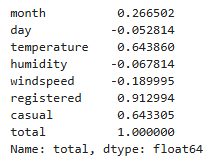
특정 상관관계 정렬해서 확인하기 높은 거
df.corr(numeric_only = True)['total'].sort_values(ascending=True)corr()을 한 눈에 시각화 하기 : heatmap
sns.heatmap(df.corr(numeric_only = True))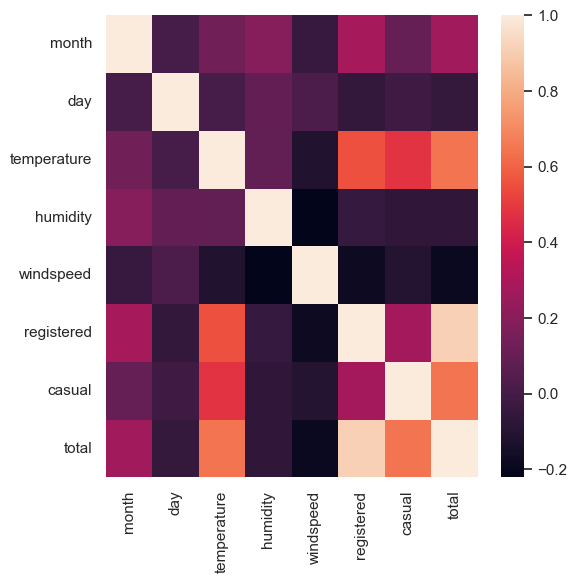
sns.heatmap(insurance_df.corr(numeric_only = True),annot = True)